Plotting Functions - Easy Plots for Data Exploration
plotting_data_exploration.RmdIntroduction
Rgemini contains several functions that facilitate
common plotting needs and allow users to create customized figures with
just a few lines of code. This vignette focuses on two basic functions
for data exploration & descriptive analyses: plot_summary() and plot_over_time()). These functions
are not meant to produce publication-ready figures, but rather, they
provide a quick and easy way of facilitating early stages of analyses,
such as: Checking variable distributions & missingness, inspecting
time trends, and visualizing differences between hospitals (or other
grouping variables).
The functions introduced here can be used to complement other (base
R) functions that allow for quick data inspection like
summary(), xtabs(), str() or
head().
Set-up
The plotting examples shown below are based on variables from the
“ipadmdad” table. Typically, you would query this table from the GEMINI
database, but for the purpose of this vignette, we’ll create some dummy
data using Rgemini::dummy_ipadmdad(). Here, we are
simulating a subset of “ipadmdad” variables for 50,000 encounters from
12 different hospitals and with discharge dates ranging from fiscal
years 2018 to 2022:
library(Rgemini)
library(ggplot2)
library(dplyr)
library(data.table)

set.seed(999)
ipadmdad <- dummy_ipadmdad(n = 50000, n_hospitals = 12, time_period = c(2018, 2022)) %>%
  data.table()
Summary plots
First, let’s use the plot_summary() function to explore
the dataset and gain a better understanding of the distributions of
ipadmdad variables in our dummy cohort.
Default plot
By default, plot_summary() creates histograms/barplots
for all relevant variables in the data input (ignoring any
encounter/patient/physician IDs and date-time variables). It will also
show some basic descriptive stats, such as % missing
(NA/""/" "), as well as median
[Q1, Q3] for continuous variables and % for categorical/character
variables. Missing values are excluded from all plots and summary
statistics.
plot_summary(data = ipadmdad)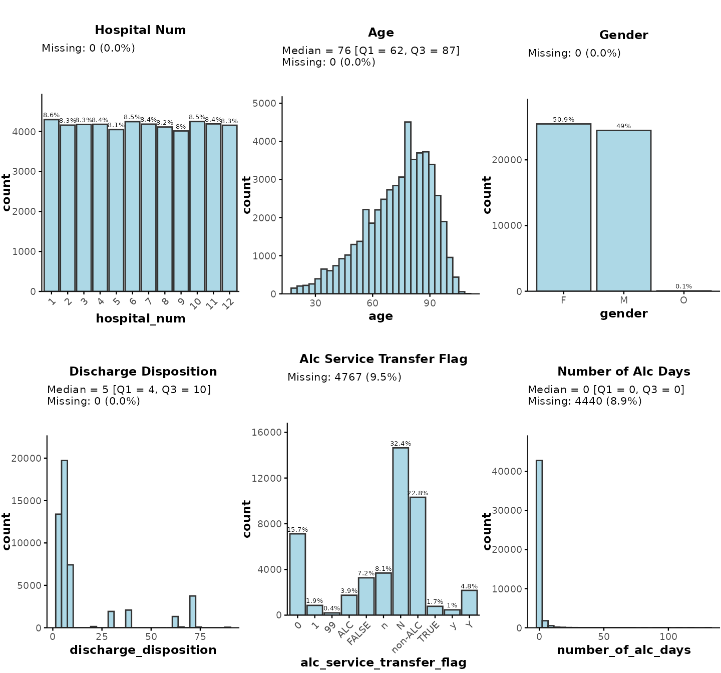
If your data input contains a large number of variables,
we recommend explicitly specifying which variables you want to include
in the summary plot by providing plot_vars as a character
vector input:
plot_summary(ipadmdad, plot_vars = c("discharge_disposition", "number_of_alc_days"))… or you could select the variables implicitly by specifying the subset of relevant columns like this:*
plot_summary(ipadmdad[, .(discharge_disposition, number_of_alc_days)])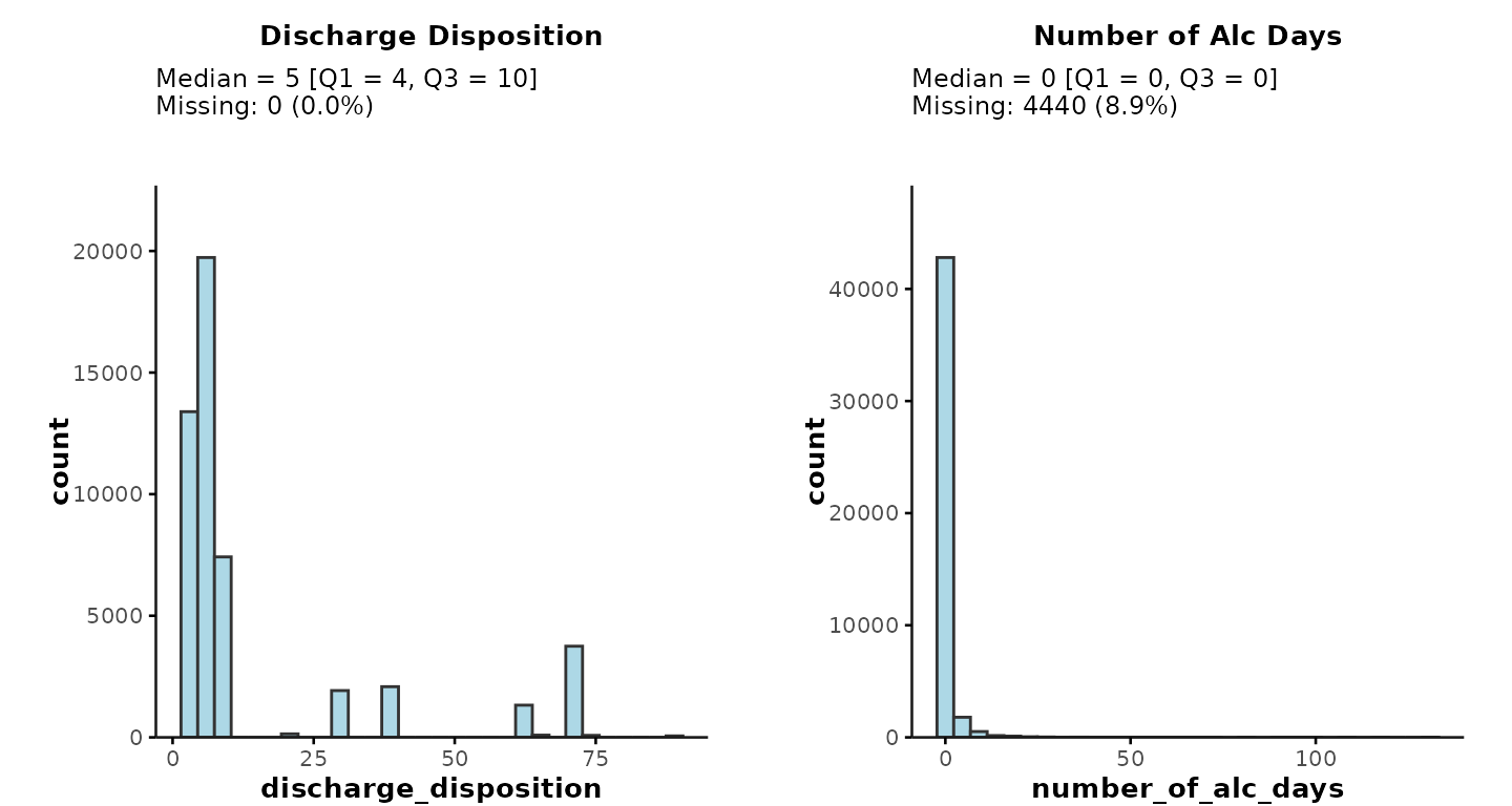
* Note: If you
select variables implicitly, any encounter/patient/physician IDs and
date-time variables will still be removed automatically by the function.
If you would like to plot any IDs/date-times, you can achieve this by
explicitly specifying a plot_vars input, e.g.,
plot_vars = "mrp_cpso_mapped" to check the number of
encounters per most responsible physician (MRP).
In general, date-time variables should be avoided in
plot_summary() unless they have been preprocessed to reduce
the number of categories (e.g., grouped into months/years). To plot time
trends, please use the plot_over_time() function
instead.
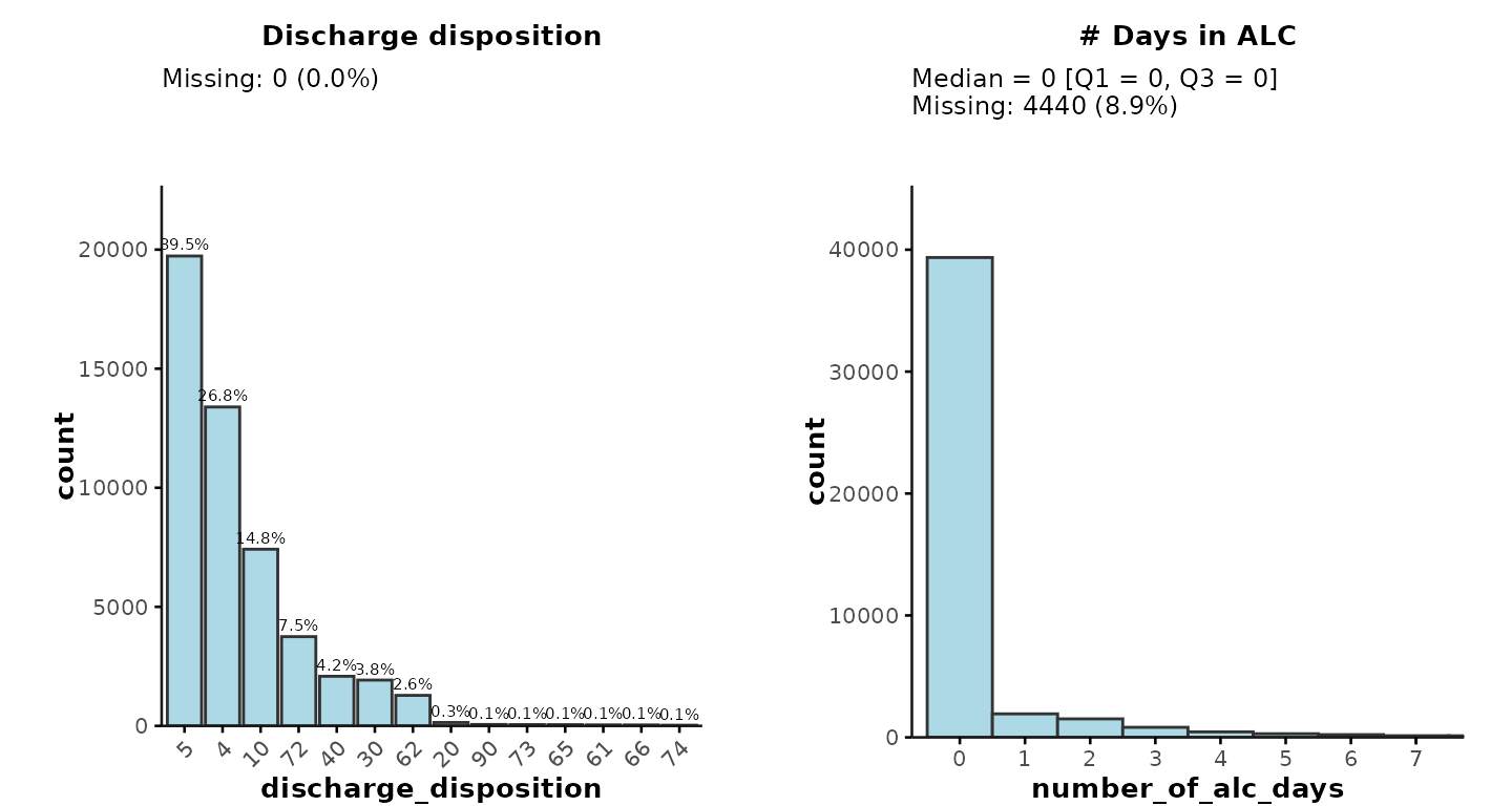
Providing plot_vars as a list
The default plots provide a quick and easy way of exploring the data,
but you may want to have finer control over the characteristics of each
subplot. This can be achieved by providing the variables to be plotted
as a list to specify additional attributes, such as:
-
Variable class: For example, discharge disposition
is of type
numericin “ipadmdad”. However, in reality, discharge disposition is a categorical variable so users can specifyclass = "character"to create a more appropriate plot. - Sorting by frequency (for categorical variables): Categories can be sorted according to the frequency of each category level. In the example below, we sort discharge disposition by descending frequency.
-
Histogram bins & breaks (for continuous
variables): For example, we may want to plot ALC days with
binwidth = 1and only show data points up to 7 days by specifyingbreaks = seq(0, 7, 1). -
Normal distribution (for continuous
variables): By default,
plot_summarywill show medians [Q1, Q3] for continuous variables. For normally distributed variables, users can specifynormal = TRUEto obtain means [SD] instead. - Subplot titles: Users can change the subplot titles by providing the desired title as the name for each list item (e.g., “# Days in ALC” instead of “Number of Alc Days”)
For example:
plot_summary(
  ipadmdad,
  plot_vars = list(
    `Discharge disposition` = list(plot_var = "discharge_disposition", class = "character", sort = "desc"),
    `# Days in ALC` = list(plot_var = "number_of_alc_days", binwidth = 1, breaks = seq(0, 7, 1))
  )
)
Applying facet grouping
plot_summary can also be used to plot separate
histograms/barplots by subgroups. This can be achieved by providing a
facet_group variable that will be passed to
facet_wrap to create separate subplots by a grouping
variable, such as "hospital_num".
For example, here we plot gender separately for each hospital:
plot_summary(
  ipadmdad,
  plot_vars = "gender",
  facet_group = "hospital_num"
)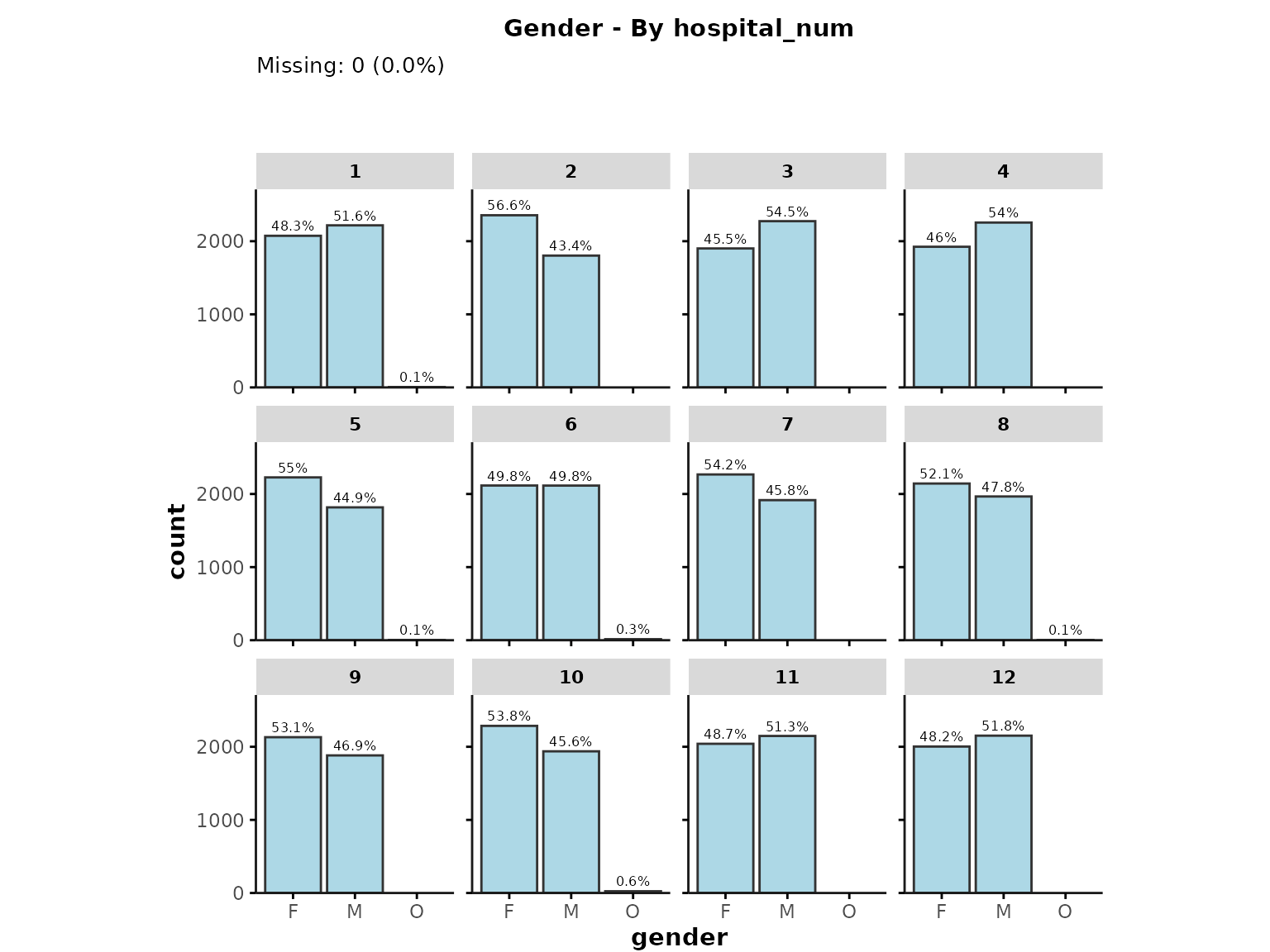
-
Note:
-
facet_groupis currently only supported if users specify a single plotting variable. - When specifying a
facet_group, any percentage values will be calculated within a given facet level. - When sorting categorical variables by frequency, values will be sorted according to the frequency in the whole data set (i.e., across facet levels).
-
Additional user inputs
Finally, users can control the following plot characteristics:
- Show percentages (instead of counts) on the y-axis by specifying
prct = TRUE - Remove the stats above each plot by specifying
show_stats = FALSE - Change the fill color using the
colorinput - Adjust the font size of each plot by specifying
base_size - Control the arrangement of subplots by providing additional inputs
that are passed to
ggpubr::ggarrange(). By default, a maximum of 9 (3x3) subplots will be shown in a single figure. If users plot more than 9 variables, multiple figures will be generated. You can change this behaviour, or re-arrange subplots by specifyingnrowandncol. You can also align subplots horizontally usingalign = "h"(relevant for ALC plot due to long x-axis labels).
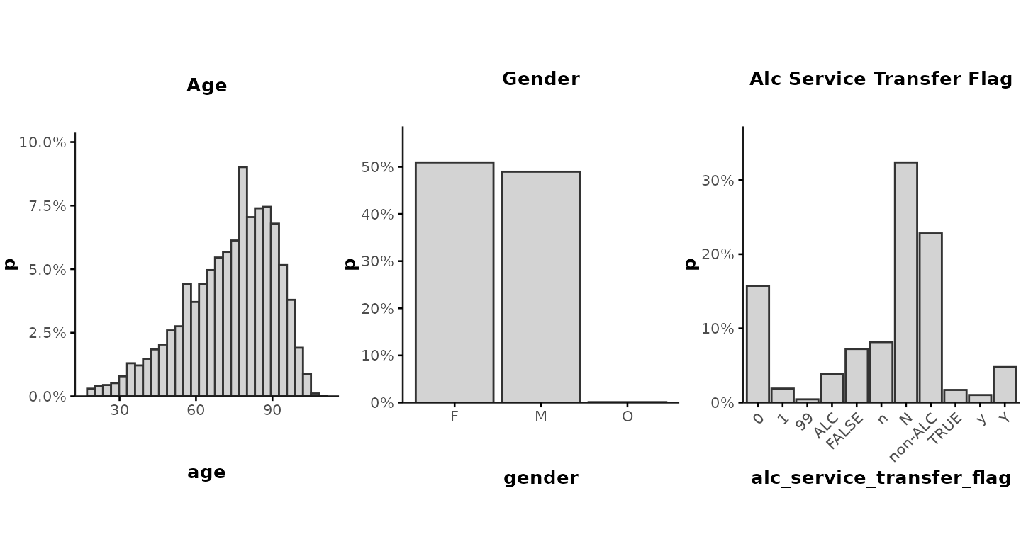
For example:
plot_summary(
  data = ipadmdad[, .(age, gender, alc_service_transfer_flag)],
  prct = TRUE,
  show_stats = FALSE,
  color = "lightgrey",
  nrow = 1, ncol = 3,
  align = "h",
  base_size = 10
)
To create a separate figure for each variable, you can specify
ncol = 1 and nrow = 1.
Note on cell suppression
The current version of plot_summary() is only meant to
be used for data exploration by the analyst. These plots should
generally not be exported/shared with external
collaborators. If you do plan to share any plots created with
plot_summary(), please make sure the plots comply with
GEMINI’s cell suppression rules to protect patient privacy.
Specifically, any categories with n < 6 should be removed from the
plots and histogram bins should be sufficiently large to ensure n >=
6 in each bin.
Plot variables over time
Another common way to explore GEMINI data is to plot variables over
time, which can be done with a single line of code using the
plot_over_time() function in Rgemini. By
default, the function assumes that users want to aggregate data by a
certain time interval (default = "month") and by hospital
(plotted as individual subplots). This can provide important insights
into differences across sites and temporal trends. We recommend
generating these plots after cohort creation to check for potential data
availability/quality issues, outliers, or biases that may have been
introduced during cohort generation.
Default plot
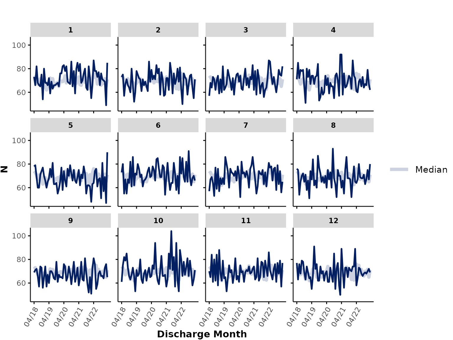
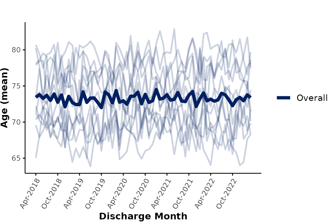
By default, the plot_over_time() function plots the mean
of a user-specified plot_var (e.g., age) by
hospital and month. For example:
plot_over_time(
  data = ipadmdad,
  plot_var = "age"
)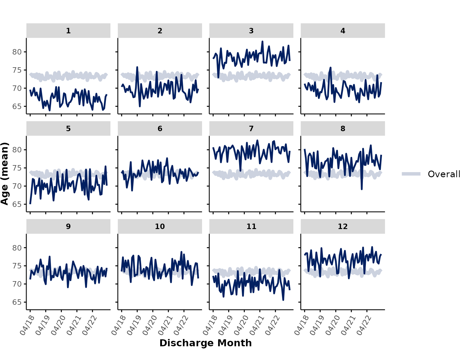
Each subplot shows the mean age at an individual hospital, and the thick line represents the mean age across all sites (note: hospitals with more encounters contribute more to this line than hospitals with fewer encounters).
Overview of optional inputs
There are several ways users can customize the default plot by providing additional input arguments, which are explained in more detail below. Briefly, users can provide the following input arguments:
-
func: What function to use to aggregate data (default:"mean"for continuous variables and"prct"for categorical variables); users can also plot number of rows ("n") or percent missing ("na") -
time_var: Date-time variable of interest (default:discharge_date_time) -
time_int: Time interval to aggregate data by (default:month, but could bequarter,year,fisc_year,season, or a custom time interval) -
line_group: Grouping variable corresponding to individual lines (default:"hospital_num"or"hospital_id") -
color_group: Grouping variable to be used for color coding of lines (e.g., hospital-level grouping by"hospital_type"or encounter-level grouping by"gender") -
facet_group: Grouping variable to be used forfacet_wrap(default:facet_group = "hospital_num"or"hospital_id"to plot individual subplots per hospital); set toNULLto plot everything in a single plot -
show_overall: Flag indicating whether or not to plot thick line showing overall result value across all individual lines (grouped bycolor_groupif specified) -
smooth_method: Method for smoothed trend lines (default:NULLfor no smoothing); set to"auto"(for flexible trend line) or"lm"(for linear trend lines). -
min_n: Minimum number of data points required per cell. Any cells withn < min_nwill be suppressed and removed from the figure -
return_data: Whether to return aggregated data instead of plotting results - Additional plotting aesthetics like
line_width,ylimits, andcolors(see function documentation for more details)
func
For continuous variables, users can specify
func = "median" instead of the default
func = "mean".
For categorical variables, the function plots percentages
(func = "prct"). Users can additionally provide
plot_cat to indicate which category/factor level to plot
(by default, the function plots the % in the last category level, e.g.,
TRUE for logical variables). For example, to plot the
percentage of female encounters:
plot_over_time(
  data = ipadmdad,
  plot_var = "gender",
  plot_cat = "F"
  # func = "%" # not required in this case because gender is a character variable, so the function infers that func should be "%"
)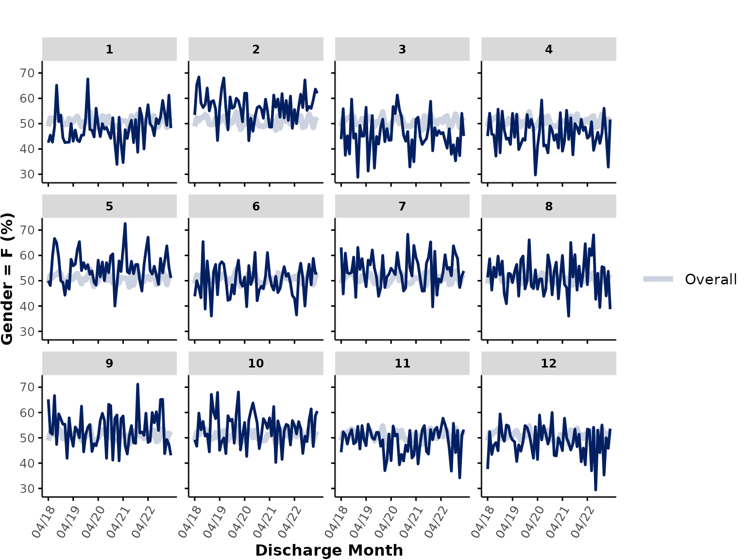
When plotting percentages, any entries that are
NA/"" are automatically removed from both the
numerator and denominator.
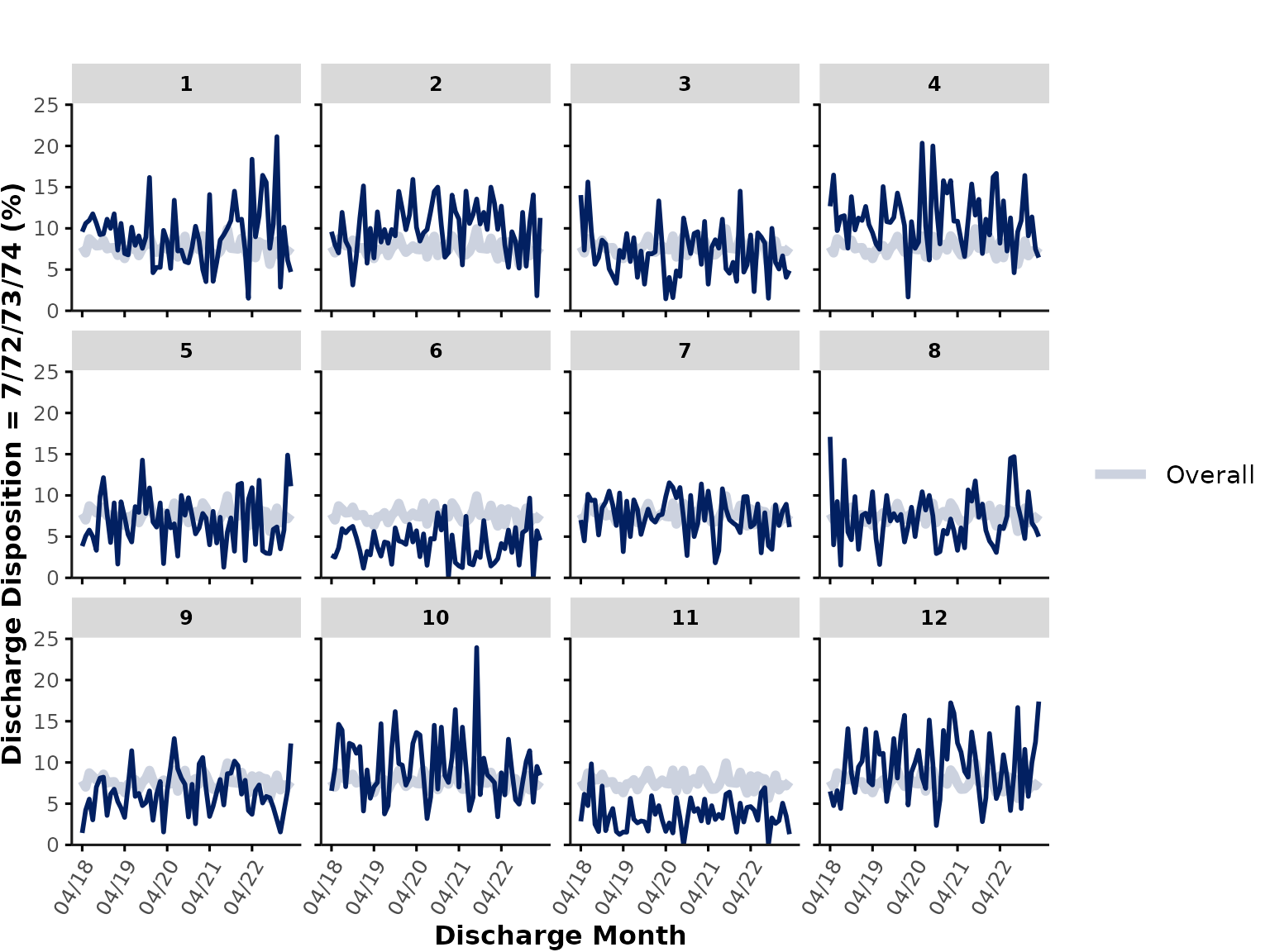
If we wanted to plot discharge_disposition, which is of
class integer, the function would by default plot the
"mean". However, in reality, discharge disposition
represents a categorical variable, so we could either transform
discharge_disposition into a factor variable before
plotting, or alternatively, we could run the following code to plot the
percentage of encounters where
discharge_disposition %in% c(7, 72, 73, 74) (i.e., % of
hospitalizations that resulted in in-hospital death):
plot_over_time(
  data = ipadmdad,
  plot_var = "discharge_disposition",
  func = "%",
  plot_cat = c(7, 72, 73, 74)
)
We can also simply plot the number of rows per month * hospital by
specifying func = "n". This is a great way to check for
potential data availability issues (e.g., time periods with 0 rows might
reflect gaps in data availability). In our example here, the number of
rows corresponds to the number of unique encounters in
ipadmdad, but depending on the table you provide as
data input, the count of rows might reflect other
variables, such as total number of pharmacy orders, lab tests etc.
plot_over_time(
  data = ipadmdad,
  func = "n"
)
Note the when we plot n, the thick “overall” line
represents the median of all (individual hospital) lines, rather than
the total count of rows across all sites.
Finally, plot_over_time() can also be used to plot the
percentage of missing data by specifying func = "na" or
"missing", which plots the percentage of all entries that
are either NA, "", or " ". Let’s
plot the % of encounters with missing ALC flag and rename the y-axis
title to "% Missing ALC":
plot_over_time(
  data = ipadmdad,
  plot_var = "alc_service_transfer_flag",
  func = "na"
) + labs(y = "% Missing ALC flag")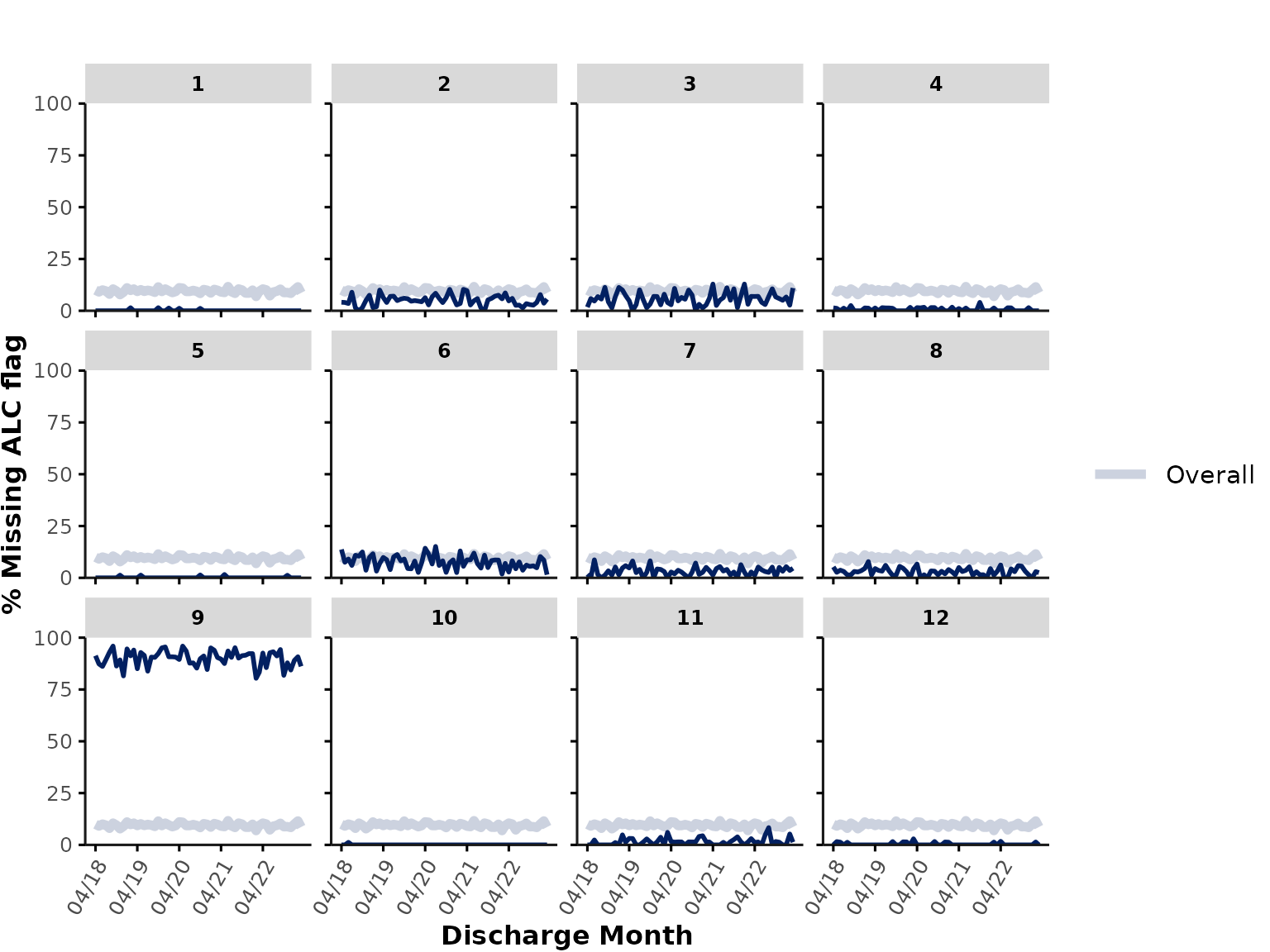
time_var and time_int
time_var specifies the variable containing the relevant
date-time information. Typically, in GEMINI data, this is
"discharge_date_time" since hospital data are pulled based
on discharge dates. time_int specifies the time interval to
use for aggregation (i.e., resolution along x-axis). By default, the
function aggregates data by month, but users could also specify
"quarter", "year", "fisc_year"
(hospital fiscal year starting in April), or "season".
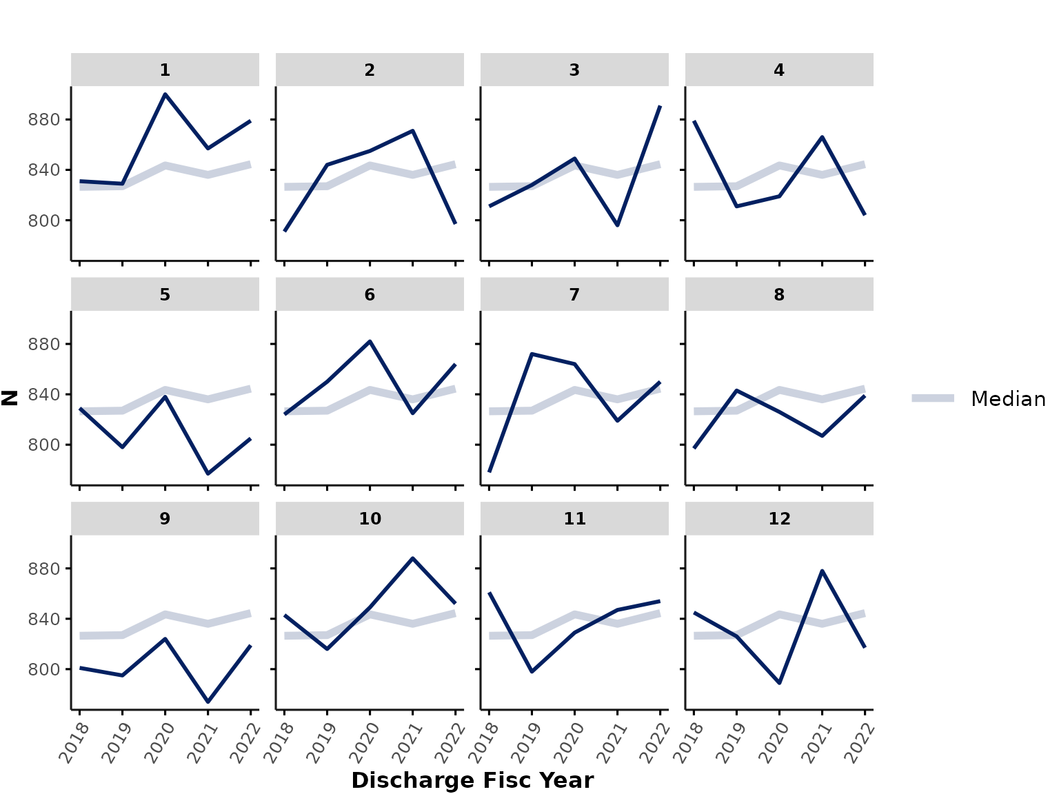
For example, we could plot the number of encounters that were discharged each fiscal year:
plot_over_time(
  data = ipadmdad,
  func = "n",
  # time_var = "discharge_date_time", # default
  time_int = "fisc_year"
)
… or the number of encounters that were admitted each season*:
plot_over_time(
  data = ipadmdad,
  func = "n",
  time_var = "admission_date_time",
  time_int = "season"
)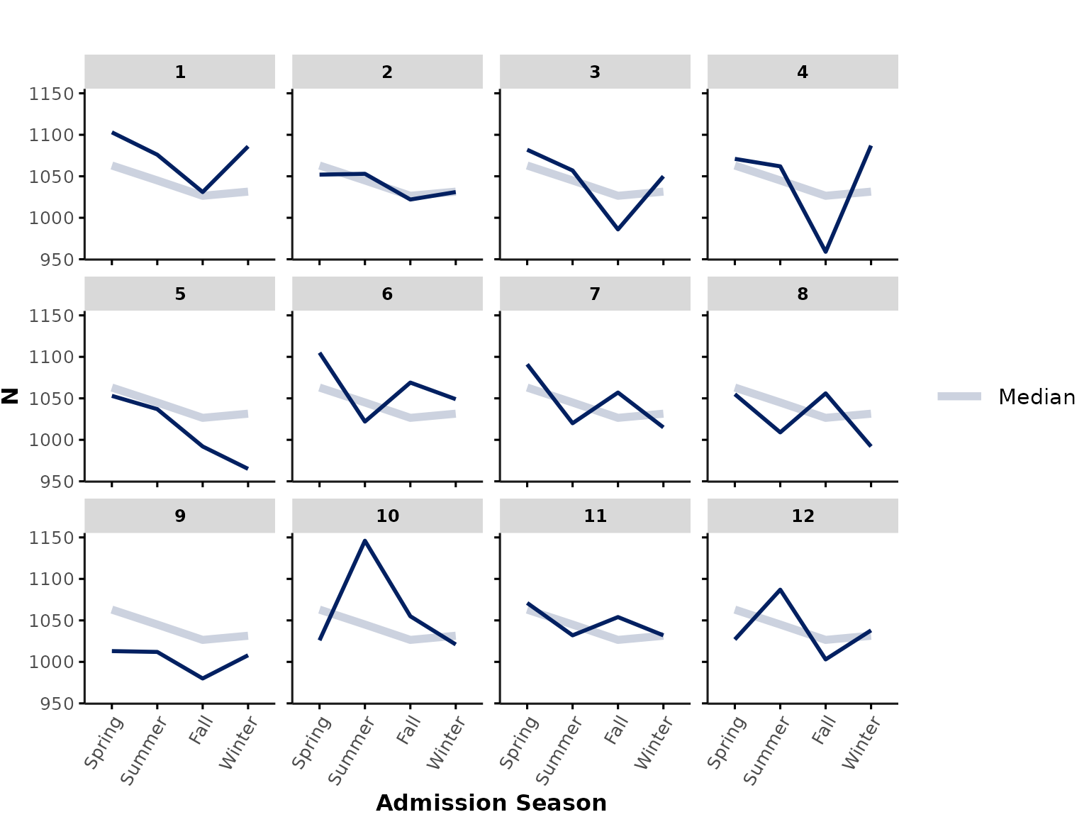
*Note: If you are plotting by admission date-time, you might be underestimating encounters at the end of the data availability timeline (because patients only appear in GEMINI data once they have been discharged). Therefore, plotting by admission date should only be done with caution and might require a buffer period that excludes data points at the end of the data availability period.
Custom time_int
Note that users can in principle specify any custom time interval as
long as this is provided as a column in the data input. For
example, let’s say we want to plot the number of encounters that were
admitted to hospital each day in April 2020. Users can calculate the
admission date prior to running the function and then provide it as the
time_int input:
library(lubridate)
ipadmdad[, my_date := as.Date(ymd_hm(admission_date_time))]
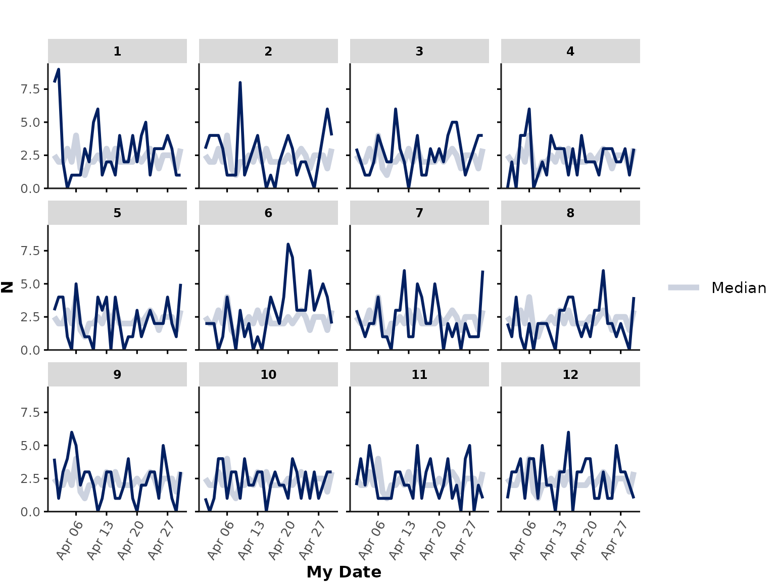
plot_over_time(
data = ipadmdad[my_date >= "2020-04-01" & my_date <= "2020-04-30", ],
func = "n",
time_int = "my_date"
)
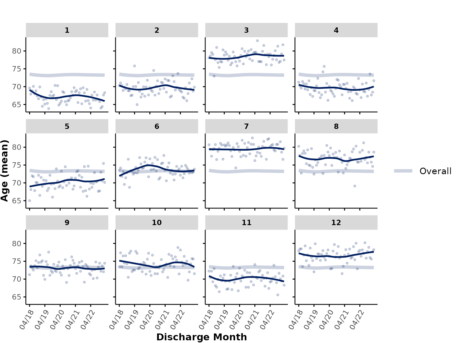
line_group
In all plots shown above, individual hospitals are shown in different
subplots. We could also show all hospitals in a single plot by
specifying facet_group = NULL. In that case, the function
still assumes that users want to aggregate by hospitals, and thus,
hospitals will be shown as individual lines (default:
line_group = "hospital_num"):
plot_over_time(
  ipadmdad,
  plot_var = "age",
  facet_group = NULL # ,
  # line_group = "hospital_num" # default
)
Alternatively, users can also specify other line_group
variables representing individual physicians, patients, or other
grouping variables.
color_group
Users can apply an additional layer of grouping based on color. For
example, you may want to group hospitals into different types, such as
academic vs. community hospitals. For illustration purposes, a random
hospital_type is assigned to our dummy data and we can then
add hospital_type as a color_group variable.
We’ll also set show_overall to FALSE here to
remove the thick overall line from all plots:
# assign (random) hospital grouping variable
ipadmdad[, hospital_type := sample(
  c("Academic", "Community"),
  prob = c(.4, .6), 1, replace = TRUE
), by = hospital_num]

plot_over_time(
  ipadmdad,
  plot_var = "age",
  color_group = "hospital_type",
  show_overall = FALSE
)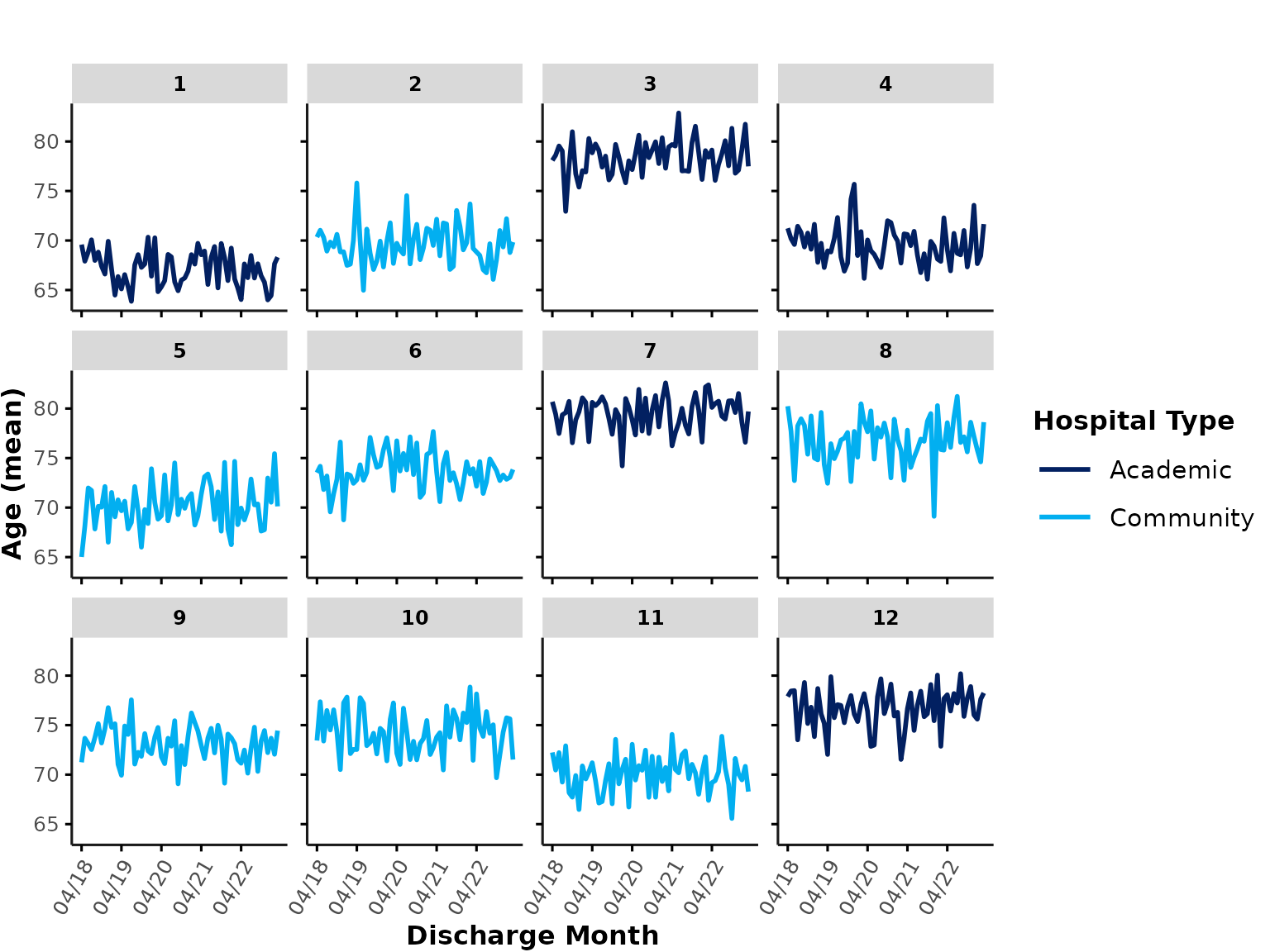
By default, the first color palette defined by
gemini_colors() (“GEMINI Rainbow”) is used for
color_group colors (see section Plotting theme & colors for more
details).
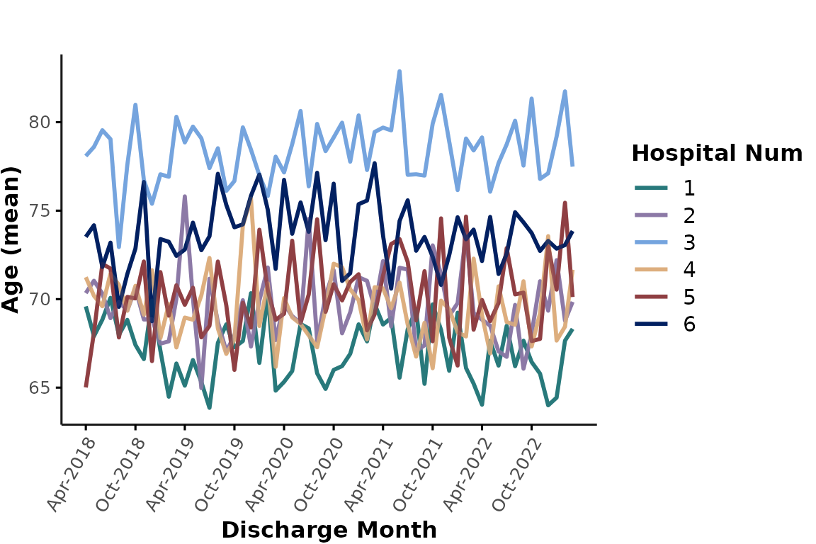
Another application of color_group could be to plot all
individual hospitals in a single plot and apply color-coding to
distinguish individual sites. This can be achieved by setting
facet_group to NULL and specifying
hospital_num as a color_group. This is not a
good option if you are plotting a lot of hospitals at the same time, but
we could for example only plot hospitals 1-6. Let’s also pick a
different color palette from gemini_colors() here:
plot_over_time(
  ipadmdad[hospital_num <= 6, ],
  plot_var = "age",
  color_group = "hospital_num",
  facet_group = NULL,
  colors = gemini_colors(4) # equivalent to gemini_colors("Lavender Lagoon") or simply gemini_colors("l")
)
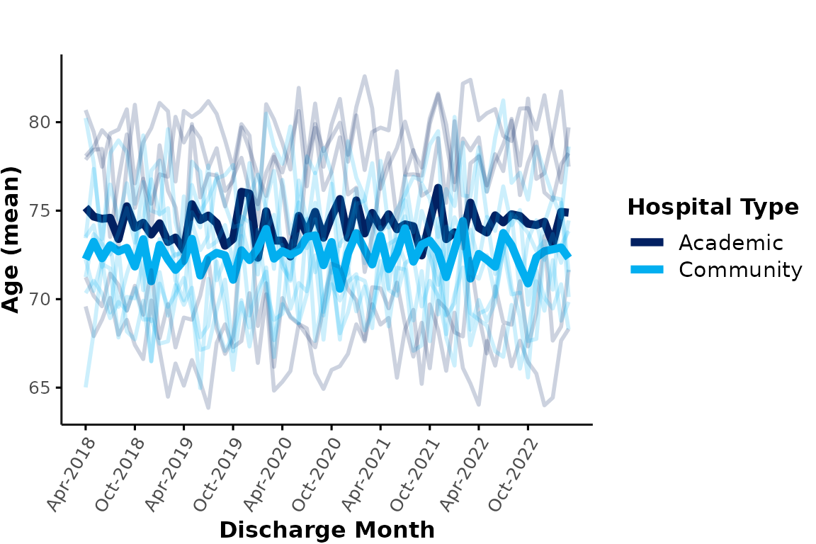
Similarly, we could plot all academic & community hospitals in a
single plot and apply color coding based on hospital_type.
Here, the thick lines represent the overall mean age at each hospital
type. Note that the data are aggregated across all encounters of each
group level (e.g., the cyan line represents the mean age of all
encounters at any community site). This means that larger hospitals will
contribute more to the average than smaller hospitals:
plot_over_time(
  ipadmdad,
  plot_var = "age",
  color_group = "hospital_type",
  facet_group = NULL
)
If this plot is too busy and you simply want to illustrate the
aggregated results by hospital type, you could suppress the individual
hospital lines by specifying line_group = NULL. You can
also provide any custom colors and specify
ylimits. Additionally, let’s add some annotations
highlighting the onset of the first COVID-19 wave in March 2020:
plot_over_time(
  ipadmdad,
  plot_var = "age",
  line_group = NULL,
  color_group = "hospital_type",
  facet_group = NULL,
  colors = c("#86b9b0", "#c266a7"),
  ylimits = c(63, 83)
) +
  annotate("text", x = as.Date("2020-03-01"), y = 80, label = "1st COVID wave", color = "#022061") +
  annotate("segment", x = as.Date("2020-03-01"), xend = as.Date("2020-03-01"), y = 63, yend = 79, color = "#022061", linetype = 2)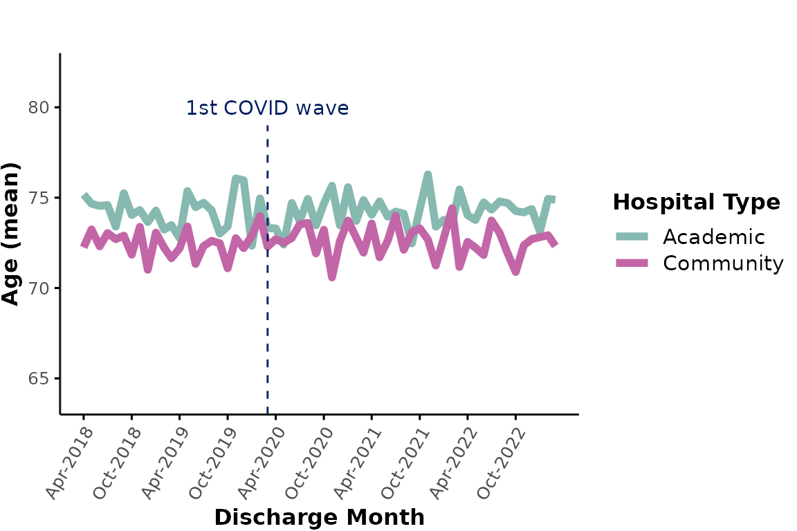
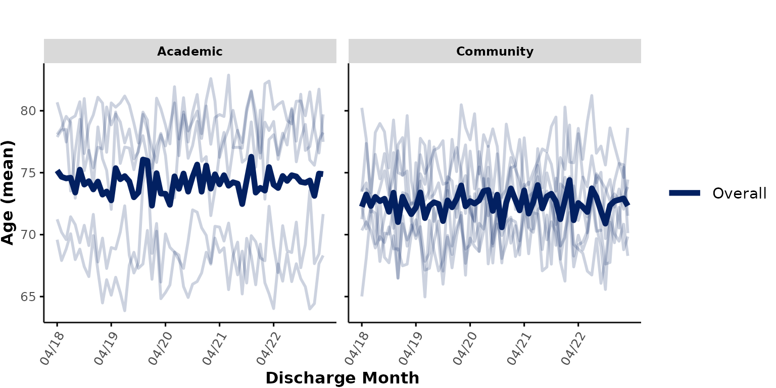
facet_group
Instead of using color coding to add grouping variables, we can also
specify a facet_group variable that is passed to
facet_wrap(). By default, facet_group is set
to "hospital_num" to facilitate visualization of individual
hospitals. However, for the purpose of comparing different hospital
types, we could instead specify
facet_group = "hospital_type" to plot academic
vs. community hospitals in separate subplots:
plot_over_time(
  ipadmdad,
  plot_var = "age",
  facet_group = "hospital_type",
  show_overall = TRUE
)
Additional inputs for facet plots
Users can provide additional input arguments that are passed to
lemon::facet_rep_wrap() (wrapper for
ggplot2::facet_wrap()), such as:
-
nrowandncolto control the number of rows and columns
-
scalesspecifying if the x-/y-axis limits should be"fixed"(default) or"free"across subplots.
“Free” scales are useful to illustrate within-hospital trends, regardless of between-hospital differences. For example, we may want to visualize the effect of “season” on the encounter numbers (regardless of total number of encounters at each hospital). Here, we plot this in a 2 x 6 facet plot with free y scales:
plot_over_time(
  ipadmdad,
  func = "n",
  time_int = "season",
  nrow = 2,
  scales = "free_y"
)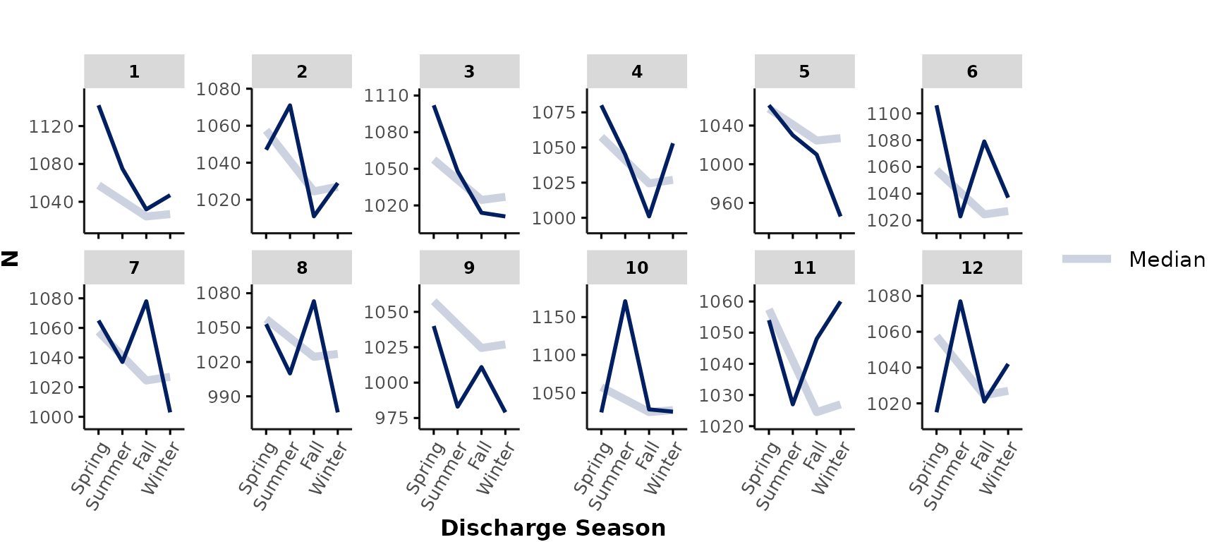
-
Note:
- If you specify a
ylimitsinput, this will overwritescales = "free"asylimitswill fix all y-axes to the specified range. - Specifying free x-scales (
scales = "free_x"orscales = "free") can result in differences in plotted timelines between hospitals and is generally not recommended for the purpose of this function.
- If you specify a
min_n
When applying multiple grouping variables (e.g., to illustrate
interactions), the number of data points per cell might be low,
especially in smaller cohorts. Users can specify min_n to
apply cell suppression to any cells with n < min_n data
points. For example, we might want to illustrate interactions between
hospital type and patient’s gender on age. Since there are
not many encounters with gender = "O", we may want to apply
cell suppression to any data points with n < 6 by specifying
min_n = 6. In our sample data, there is no cell with
gender == "O" that has at least 6 data points, so results
for gender = "0" are fully suppressed in this example:
plot_over_time(
  ipadmdad,
  plot_var = "age",
  line_group = "gender",
  color_group = "gender",
  facet_group = "hospital_type",
  min_n = 6,
  show_overall = FALSE
)
#> Warning in FUN(X[[i]], ...): The following levels of input variable 'gender'
#> were removed from this plot due to cell suppression (all n < 6):
#> [1] "O"
#> Warning in facet_rep_wrap(~get(facet_group), ...): `facet_rep_wrap` and
#> `facet_rep_lab` have been soft-deprecated. A replacement can be found in
#> ggh4x::facet_wrap2.
#> Warning: The `margin` argument should be constructed using the `margin()` function.
#> The `margin` argument should be constructed using the `margin()` function.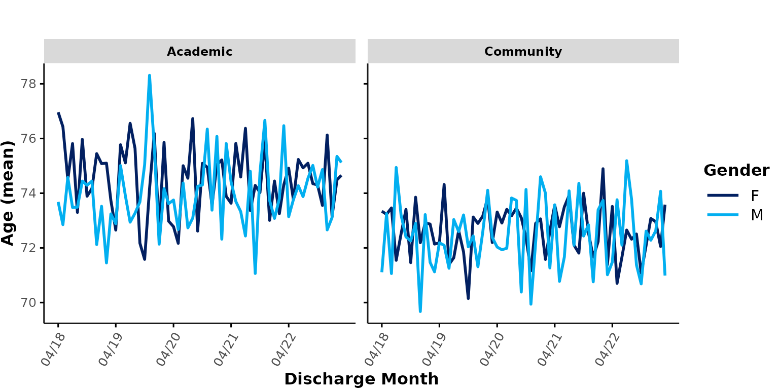
A warning message is shown to inform users about any groups (or individual cells) that were excluded due to cell suppression.
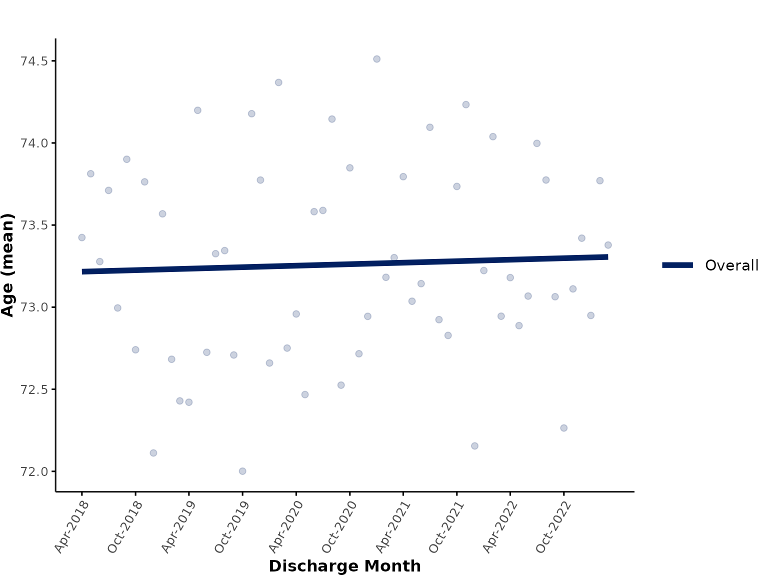
smooth_method
To facilitate visualization of time trends, users can specify a
smoothing method (also see ? geom_smooth), such as
"auto" for a flexible, non-linear trend line or
"lm" for a linear trend line. Individual data points are
now shown as dots. Note that the trend line is fitted to the aggregated
data points (i.e., in this case, each month contributes equally to the
trend line, regardless of number of data points).
plot_over_time(
  ipadmdad,
  plot_var = "age",
  smooth_method = "auto"
)
In this plot, the “Overall” line now represents a trend line fitted to the data aggregated across all hospitals.
You could also only show the overall, aggregated trend line (plus overall data points aggregated across the whole dataset) in a single plot. Here, we plot a linear trend for illustration purposes:
plot_over_time(
  ipadmdad,
  plot_var = "age",
  facet_group = NULL,
  line_group = NULL,
  smooth_method = "lm"
)
return_data
There might be situations where users want the function to return the aggregated data, instead of plotting the results. This could be useful for debugging purposes, checking for outliers, or to further process the data before plotting the results (e.g., additional exclusions etc.). It also allows users to plot the aggregated data with other plotting packages/apply further customization to the plots.
To retrieve the aggregated data, simply specify
return_data = TRUE:
res <- plot_over_time(
  ipadmdad,
  color_group = "hospital_type",
  func = "median",
  plot_var = "age",
  return_data = TRUE
)
This will return a list of 2 data.table objects:
The 1st list entry corresponds to the results aggregated by time
interval (default = "month") and all
grouping variables (line_group, color_group,
and facet_group - if any). For example, here we grouped by
line_group = "hospital_num" (default) and
color_group = "hospital_type" so the output will look like
this:
| discharge_month | hospital_num | hospital_type | median_age | n |
|---|---|---|---|---|
| 2018-04-01 | 1 | Academic | 73.0 | 73 |
| 2018-04-01 | 2 | Community | 73.0 | 73 |
| 2018-04-01 | 3 | Academic | 83.0 | 57 |
| 2018-04-01 | 4 | Academic | 73.0 | 71 |
| 2018-04-01 | 5 | Community | 68.5 | 78 |
| 2018-04-01 | 6 | Community | 78.0 | 73 |
The 2nd list entry corresponds to the higher-level grouping into the
“overall” results (i.e., thick summary line in the plots above), which
only groups by time interval and color_group (if any), such
as hospital_type in our example:
| discharge_month | hospital_type | median_age | n |
|---|---|---|---|
| 2018-04-01 | Academic | 80 | 335 |
| 2018-04-01 | Community | 76 | 500 |
| 2018-05-01 | Academic | 77 | 349 |
| 2018-05-01 | Community | 77 | 520 |
| 2018-06-01 | Academic | 77 | 363 |
| 2018-06-01 | Community | 75 | 473 |
In both tables, n corresponds to the number of data
points in each cell.
Notes on using plotly
It can be useful to apply plotly::ggplotly() to create
interactive plots that can further facilitate data exploration. However,
please note that ggplotly can mess with certain plot
aesthetics. For example, if we apply ggplotly to the
default plot_over_time, the axis labels now overlap with
the x-tick marks and the legend position has been moved to the top
right:
library(plotly)
ggplotly(plot_over_time(data = ipadmdad, plot_var = "age"))
You can apply any necessary adjustments to the returned ggplot and/or
run plotly::layout() to achieve the desired aesthetics. For
example, to move the “Discharge Month” label and change the legend
position:
# create plot
my_plot <- plot_over_time(data = ipadmdad, plot_var = "age")

# adjust space for x-axis title
my_plot <- my_plot + labs(x = "\nDischarge Month")

# apply additional formatting using layout()
ggplotly(my_plot) %>%
  layout(legend = list(x = 1, y = 0.5)) # change legend position